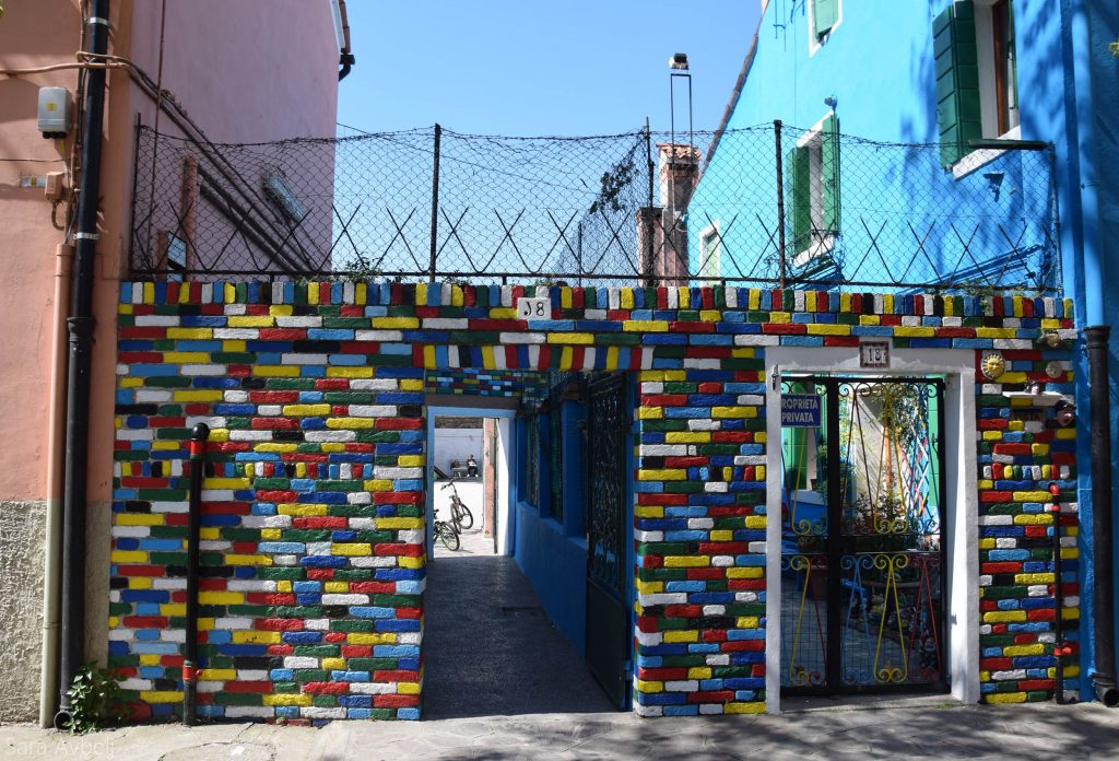
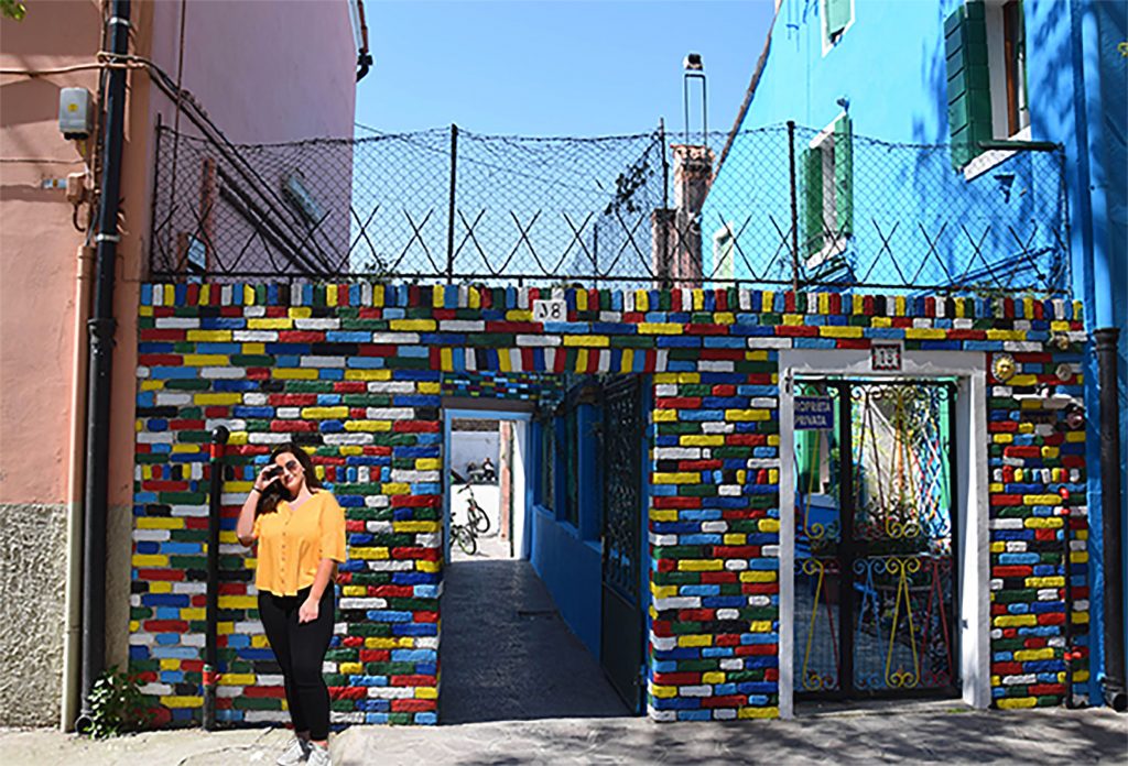
REALISTIC PHOTO EDIT
I imported the images into the program where I first cut out the person with a layer mask and connected the color corrections to the cut mask. I added more shade to make this look as realistic as possible. In the end, I gave another color correction over everything.
FACE RETOUCHING
Next, I imported the image into the program. I immediately made a copy of the Background layer on which I immediately started making corrections of the treatment so I removed all the pimples and beauty spots that I didn’t want to be visible in the picture. Then I made a copy of the layer on which I put a layer mask and with it made her skin look cleaner (blur tool). Finally, if I marked the eyebrows, eyes and lips use separately of course and changed the color of the eyes and made the lips and eyebrows more accentuated with a layer mask and color correction.
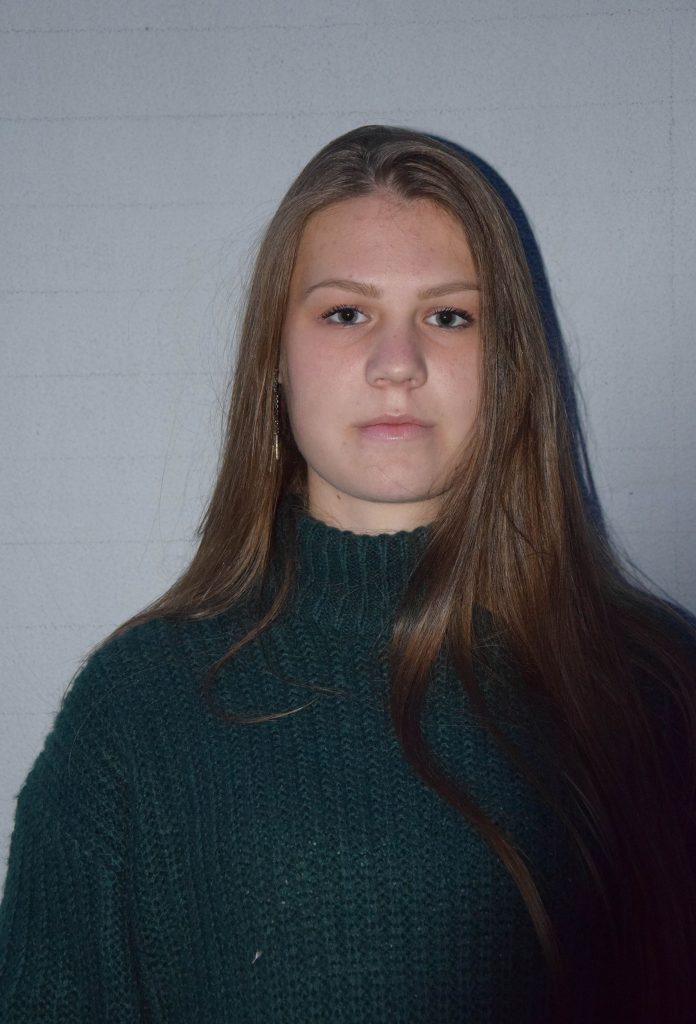
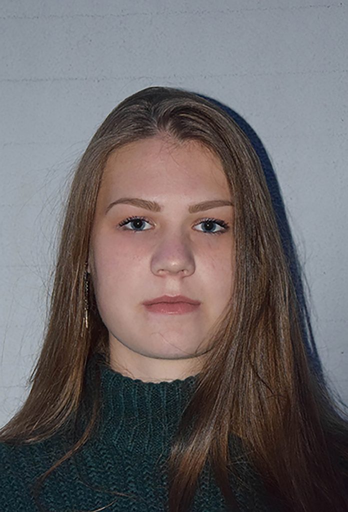
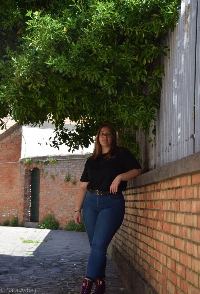
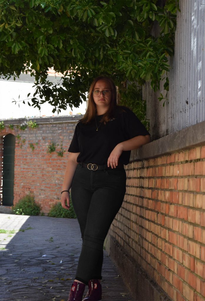
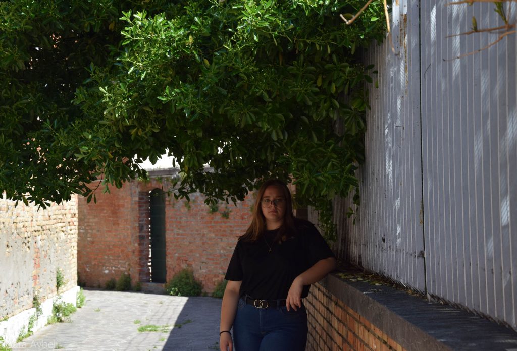
FIGURE RETOUCHING
For a start, I imported two pictures into the program, one of the figure and one only of the face I wanted to fix in the original picture. I cut out the face with a layer mask and with color correction repairs so that the color difference is almost imperceptible. then I made a copy of the original body image on which I used a liquify tool to repair my physique. Finally, I changed the color of the pants to black with a layer mask and color correction.
LETTERS – Silhuette
The letters I made are named Silhuette in and were created FontLab. But even before I edited them I had to make as many sketches as possible and when I finally drew the sketch of the font I wanted to make I drew it exactly on 3mm paper. Later when I was happy with the drawn letters I scanned them, and imported them into Adobe illustrator where i traced them. Only then were the letters ready for import into FontLab.
Please wait while flipbook is loading. For more related info, FAQs and issues please refer to DearFlip WordPress Flipbook Plugin Help documentation.
CALENDAR
The calendasr was made for the year 2022 on the theme of nature
Please wait while flipbook is loading. For more related info, FAQs and issues please refer to DearFlip WordPress Flipbook Plugin Help documentation.
CORPERATE IDENTITY
Corporate identity manual for the fictional company SATIKE. The CGP shows the LOGO (color, black and white, black and the negatives) as well as all correct and incorrect uses of the logo, colors, typography, advertisement, applications and accidental printed matter.
Please wait while flipbook is loading. For more related info, FAQs and issues please refer to DearFlip WordPress Flipbook Plugin Help documentation.
ANNUAL REPORT
Below is an example of the annual report that I prepared for this fictional company, and the text is copied from the annual report of the Mercator Group.
Please wait while flipbook is loading. For more related info, FAQs and issues please refer to DearFlip WordPress Flipbook Plugin Help documentation.